
What Color to Consider When You Design a Food Label
Have you ever caught a glimpse of a Reese’s Peanut Butter package in the checkout line and got an immediate craving for chocolate and peanut butter? Or how about the large, orange G on the Gatorade bottle? Did it make you feel extra thirsty as you finished up a hard day of work?
Colors on food labels don’t happen by accident. When you design a food label, color has to be at the forefront of your mind or you could be losing sales. One study illustrated this point perfectly.
The Candy Challenge
In 2013, a study was done by Cornell University to see how color influences buyer behavior of these candies. Half of the participants were shown a green candy bar label, while the other half was shown a red candy bar label. The content on both wrappers was the same. The color was the only difference.
Researchers asked participants to comment on how healthy the candy bar was compared to other candy bars (even though both were identical). Perhaps not surprisingly, the participants gave the green label higher marks for good health than the red.
The same experiment was done with a green vs. white label. These results were a little bit more telling.
For participants who did not place an importance on healthful living, there was no difference between the green and white labels. For participants who considered themselves to eat healthily, the green bar far outweighed the health benefits of the white bar.
Color Influences Buyer Behavior
Colors on labels have a dramatic influence on a buyer’s perception of a product. Each color means something a little different. Even colors in the same category can have different connotations. Take a look at these warm colors as an example:
- Red inspires feelings of youthfulness and boldness
- Yellow inspires feelings of clarity and warmth
- Orange inspires more cheerful feelings
When it comes to food labels, colors are even more important. There is an emotional connection with food, but that’s not all. There is also a psychological trigger that happens when colors are associated with certain types of food. That’s why McDonald’s, Wendy’s and Burger King all use reds and yellows (appetite inspiring colors), while Subway uses green and yellow (healthful living colors).
Here are a few guidelines for you as you design a food label.
Warm Tones
Red and orange have a large spectrum of feelings associated with it. Sometimes it can stimulate your appetite and cause you to salivate even when you’re not hungry (never paint your kitchen red), while other times it can symbolize jolts of energy.
If your product is more of an impulse buy to give buyers a quick sugar or energy shock, red is a smart choice.
The Warm Tone Caveat: Yellow
Yellow is best used in harmony with another color. It pops, which sends a signal that the food it’s being used to advertise will pop with flavor too. It’s ideal for anything geared toward kids who are looking for that excitement in their meals.
Earth Tones
We’ve already discussed that green food labels tend to be more geared toward healthy living. The reason why is because green is so often seen in nature. Using this hue immediately makes a person subconsciously think about the great outdoors.
Browns are another earth tone, often used in gourmet foods. This color is most often used in two categories:
- Anything chocolate-y
- Any natural product wanting to convey an “earthy” appeal
Cool Tones
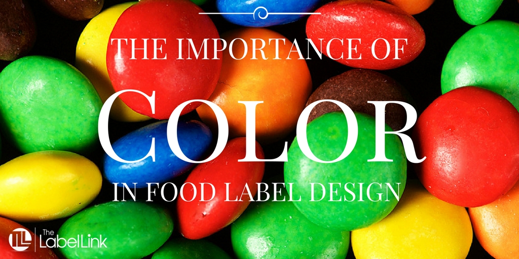
Blues and purples don’t do much in terms of stimulating a person’s appetite, so they’re best used in harmony with other colors that do. Walk up and down the food aisles. The only time you’ll see blues and purples being used is in a “rainbow” of other colors, such as on Skittles packets or certain types of cereal.
Final Consideration: Flavor
We talked about brown being used in anything chocolatey. That’s because people tend to associate brown with chocolate.
The same can be true of other flavors. The colors you use should quickly convey what the person will taste when they take their first bite. For example, if you sell a blueberry muffin, using blue in your label can send a direct signal to your buyer that your product is berry flavored. It’s still a good idea to use this in harmony with another appetite stimulating color to encourage your customer to buy.
Question: What colors are you using to help sell your food or beverage product?
Food is directly correlated with emotion, which is why color plays such an important role in your packaging design. Pair your food with the right colors to conjure up feelings, emotion and memories associated with what you’re selling and you have a better chance at boosting your sales.