
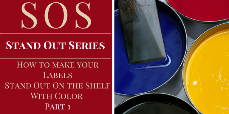
Got color? A dash of color can breathe life into the most mundane of products. In can breathe life into the ordinary, and turn it into the extraordinary.
Welcome to the first of eight installments in our Stand Out Series: How to Make Your Labels Stand Out On The Shelf.
Every other week, we will explore a different aspect towards making your attractive and eye-catching labels that will stand out on the shelf.
The focus for this week?
How to use color to make your labels stand out.
Why colors are necessary design
If you’re trying to make your labels stand out on the shelf, the color is the first and most important aspect you need to consider. Research has shown that up to 93% of consumers make snap judgments about a product within 90 seconds based on color alone – making color the first port of call in producing eye-catching and attractive labels. Apart from only getting immediate consumer attention, you can also use color to:
- Highlight specific words/label areas
- Establish brand identity
- Convey meaning
The Label Link guide to best usage of label colors
So you already know about the importance of color to creating awesome labels (pat yourself on the back). The question you may be asking is which particular colors should you use for your label?
The answer to that will depend on the feelings you’re trying to evoke in your potential customers and what mood you want to draw out. Gregory Ciotti in Entrepreneur Magazine cited The Logo Company’s research on color psychology. Listed below is a summary from that article of the top label colors along with the respective moods and feelings they invoke. Also noted are the ideal situations in which these colors are best suited:
Color: Red
Mood: Excitement
Feelings: Youth, boldness
Red is one of the most popular colors due to its eye-catching properties – out of all the colors, red is the one that will capture customer attention most quickly and effectively. In particular, red is used for food labels, since it (allegedly) triggers appetite. You should think strongly about incorporating red in your labels.
Color: Yellow
Mood: Optimism
Feelings: Clarity, warmth
Yellow, often known as the “happiest” color, is usually associated with positive emotion and cheerfulness. This type of color is best suited for products aimed at children or adolescents.
Color: Orange
Mood: Friendly
Feelings: Cheerful, Confidence
Orange is another attention grabbing color, and can be used on labels to convey confidence and willingness to stand out of the crowd. Orange usually conveys that a product is affordable.
Color: Purple
Mood: Creative
Feelings: Imaginative, Wise
Purple conveys that the product is creative, grand, and out-of-the-box in terms of intelligence and wisdom. Applicable to a broad range of goods and services.
Color: Blue
Mood: Trusting
Feelings: Dependable, Strength
Blue is used primarily to convey that the product or brand is trustworthy and is used especially by companies selling electronics.
Color: Green
Mood: Peaceful
Feelings: Growth, Health
It is only recently that green has become a favorite color for certain types of products such as food. With the rise of the eco-friendly movement, however, green has become the go-to color for those are aiming to show that their products are environmentally friendly, sustainable, or natural.
Guidelines to consider when using color to make your labels stand out
Apart from the mood or emotion you’re trying to evoke with your customers, there are many other important issues to consider when deciding on colors that will make your label stand out. These include:
- Complementary text and background– You want to ensure that your label’s text can be easily read on whatever background is being used, whether it’s the product packaging or the product itself. If you’re using a product with the “no label look”, you will want to ensure that your text contrasts well against the product background
- Differentiation – You will want to make sure that the colors on your label are distinct enough from other competitors that customers won’t be confused or accidentally another product over yours because they look too similar. Choose a distinct and different style from your competition.
- Color product consistency – In keeping with color psychology as mentioned above, you will want to use colors that are consistent with the product being offered
- Overall legibility of design – there is such a thing as “too much”. You don’t want to splash a bunch of bright colors in the name of attracting attention that leave your customers confused
- Target audience consideration– Your target audience will also be a key deciding factor in what colors you use. For example, primary colors are typically used for children or adolescents. Pastels are often marketed towards women or babies and black is often paired with white for the luxury audience.
- Use gradients of colors – A good usage of different gradients and shades of color of will allow you to create a label with texture and depth, making your label far more attractive than the other boring labels!
If you’d like more information on how to choose colors that will make your labels stand out on the shelf, you can email us. And, be sure to check the box for more useful tips when you do!
We’ll be pleased as Raspberry Red Punch to provide feedback on how we can help you to create labels that will be sure to grab your intended customer’s attention.
Question: How much thought have you put into your brand colors and the emotions they evoke? Please share your answers in the comments section of our blog.